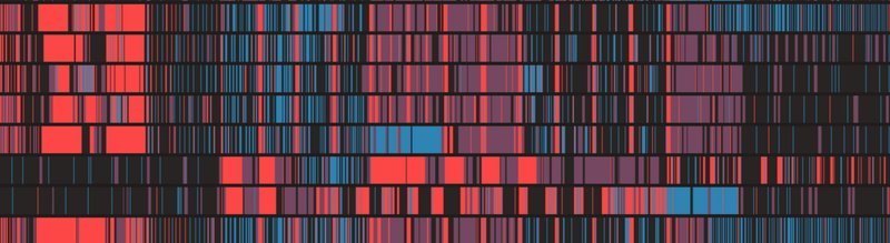
Good decisions are made when everyone involved has a clear and common understanding of the current situation. Data visualisations are a great way of building that common understanding. Moreover, beautiful visualisations and data tools encourage people to get involved.
Dragonfly Data Science builds data visualisations that guide and communicate decisions by wrapping around an organisation’s operational data. Dragonfly Data Science can help with every stage of developing a great data visualisation.
The process starts with understanding the existing data. We have a team of analysts and machine learning experts who can highlight the important signals in your data. We build on an organisation’s strategic objectives to develop data visualisation concepts that show how the data’s signal can guide decision making.
Great data visualisation comes from great design. Leading on from the data work we will create a design brief with your team. The brief creates a clear common ambition for the data visualisation, and a way of testing success. It will also ensure that the data visualisation is consistent with your organisations communication style and tone.
From the brief we will start the design and build. The data visualisation can be presented in a range of ways, from print ready documents, to live updating interactive web tools.
For a great example of an interactive tool that Dragonfly Data Science have deployed on the Catalyst Cloud, see the Kōkako iwi radio monitoring system.